
11 Color
Best Practices:
- Don’t use color as the only way to convey information, use color as a secondary indicator of meaning
- Use high contrast colors and color checking tools to ensure that color blind and low vision readers can fully understand your work.
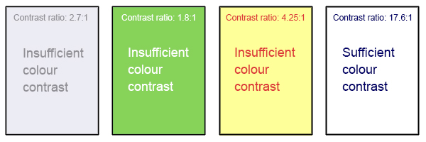
- The WCAG 2.0 require that color combinations meet clearly defined contrast ratios. In order to meet the guidelines at Level AA, text or images of text must have a contrast ratio of at least 4.5:1 (or 3:1 for large text).
- Links should be visually distinct from other text, if color is the only distinction than the link color must have sufficient contrast between both the background and the non-link text.
Resources
- WebAIM’s Color Contrast Checker: This web-based tool allows you to select or enter color values to test, and provides you with a “pass” or “fail” on your contrast ratio.
- ACART’s Contrast Checker: This is a straightforward, web-based tool you can use to both check color contrast and view your selections in grey scale. This tool also allows you to keep a history of the color combinations you have tested.
- CUNY accessibility toolkit: color
- BC Campus accessibility toolkit: colour contrast
Attribution
Parts of this chapter were adapted from the Accessibility Toolkit 2nd Edition: Colour Contrast by BCcampus which is licensed under a Creative Commons Attribution 4.0 International License.
Media Attributions
- Colour Contrast © Hilda Anggraeni (BCcampus) is licensed under a CC BY (Attribution) license
